
At Gogiya, we’re all about great food, good vibes, and unforgettable moments around the grill. Inspired by the lively energy of Korean BBQ, we bring people together with bold flavors, premium ingredients, and the joy of cooking right at the table. Whether you're a seasoned BBQ lover or trying it for the first time, Gogiya is where the heat meets the heart.
This project was developed as part of a design brief from DesignerBriefs, where the challenge was to design a social, authentic, friendly and bold brand identity and Menu Card that reflects Gogiya’s essence.
DESIGN PROCESS
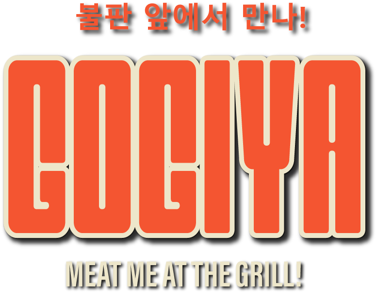
Brand Identity

Gogiya is a celebration of Korean BBQ culture, where fire, smoke, and sizzling flavors come together. The design reflects this energy through bold, dynamic typography and a fiery color palette that captures the essence of an authentic grilling experience. The goal was to create a visual identity that feels inviting, vibrant, and full of life — just like a bustling Korean BBQ spot.

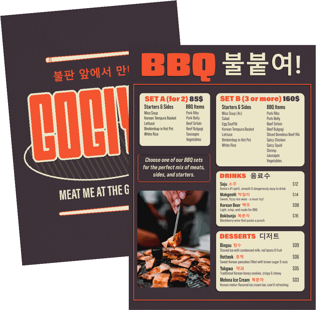
Menu Design
The menu design is a perfect blend of simplicity and boldness, featuring an eye-catching layout that enhances the dining experience. The warm orange (#F45531) adds energy and appetite appeal, while the deep plum (#443842) brings contrast and depth. To balance it out, the soft beige (#EDE6CA) creates a friendly and inviting backdrop.
The bold typography reinforces the lively, dynamic feel, while the thoughtfully structured sections make navigation effortless. A special emphasis on BBQ Sets allows customers to quickly choose their meal, keeping the focus on enjoying the food and experience rather than searching through options.

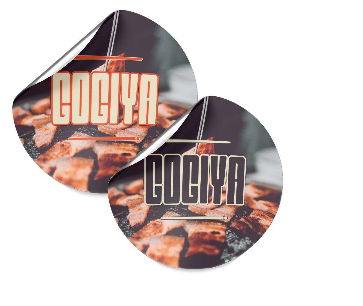
Product Storytelling
I wanted to blend authenticity with modernism, creating a design that feels both timeless and fresh. With expressive letterforms and warm tones, this brand tells a story of tradition meeting creativity. The dynamic use of color adds vibrancy, allowing the brand to evolve while staying true to its unique identity.